How to Choose the Right Colors for Your Brand
Brand colors are a key component to your business’ visual identity. Your brand colors convey a lot about who you are as a business and how you want your customers to feel when they see you.
We want you to keep in mind that there’s more to it than just picking out your favorite colors and calling it a day. There’s a process and questions to ask yourself before choosing the best colors for your brand. Sound like a lot? Not to worry, we’re taking you through the ins and outs of choosing the best colors for your brand.

Brand Colors 101
There are typically 3-8 colors that create a brand’s color palette. There are 2 types of brand colors: primary brand colors and secondary brand colors.
Your primary brand colors are the colors that will be used in all of your marketing materials and will typically show up in your logo. You’ll choose 2-3 primary colors to be the center of your brand's visual identity. It’s recommended that you rarely change your primary colors. It’d be like Target changing their red logo to a blue logo. So be sure to give these primary colors some thought!
Next you’ll choose about 5 or so secondary colors. These colors should complement your brand’s primary colors and can be interchanged between your marketing materials. Selecting a variety of secondary colors will help you stay on brand because you’ll have different options to use as you create different pieces of marketing.
A Note on Color Theory
Now that you know you need some primary and secondary colors - here is a quick note on color theory. Don’t go down a rabbit hole here! This is just to give you an idea of what colors mean. Here’s a short and sweet list to give you some inspo:
Red is the color of passion and energy. It draws attention and gives off a strong and powerful energy.
Orange is the color of enthusiasm and emotion. It gives off a feeling of warmth and joy.
Yellow is the color of happiness and optimism. It’s a cheerful and energetic color that brings fun and joy to the world.
Green is the color of harmony and health. It’s a relaxing color that leaves us feeling safe and secure.
Blue is the color of trust and loyalty. Blue has a calming and relaxing effect. It can make us feel confident and secure.
The list of colors goes on forever so we encourage you to do some of your own research to get a feel of what different colors mean. However, there’s no need to spend too much time on this. Use it for some guidance and to get a feel of what you want your brand to convey to others. We have a helpful tool that we’ll touch on a little later.
How do you want your brand to feel to others?
It’s time to ask yourself some questions to get clear on what your brand's goals are and how you want your audience to feel when they come across you.
Some things to think about are…
What do you want your audience to accomplish when they visit your brand? Will they walk away feeling happier, more informed about their health or finances?
Do you want them to feel joyful, positive and more confident? And then lastly what are your brand's personality traits? Is your brand fun, serious, inspirational or sarcastic?
These questions can help you narrow down your primary and secondary brand colors. Let’s say you are a virtual assistant and you’re excited to help people feel more confident in their business. Not to mention, you also want potential clients to walk away from your brand feeling excited. The two primary colors you might choose are blue and yellow. Blue is associated with confidence and yellow is an energetic color.
Once you’re feeling happy about your colors it’s time to take a step further and finalize your color palette. Something to keep in mind is that there are all sorts of shades of colors so if you’re excited about blue and yellow, there are so many variations to choose from. The next step will help you nail down your exact primary and secondary brand colors.
Use the Canva Color Palette Generator
Canva has an amazing tool called the Color Palette Generator. You can scroll through Pinterest or google and find images that reflect your ideal brand colors. You’ll then upload the image in this tool and it will pull the color palette for you.
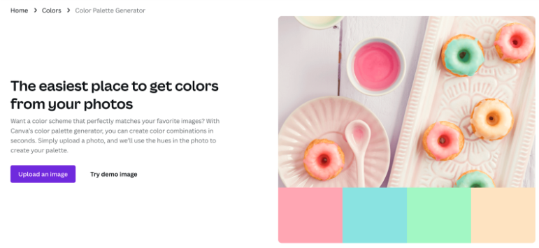
Along those same lines, Canva will also pull other color palette ideas for you so you can keep seeing different versions of the brand colors you chose from earlier.

Once you find a combination you love it’s time to get your brand out there!
Where should you apply your brand colors?
Once you have your primary and secondary brand colors finalized, here’s where you’ll incorporate them in your business. Make sure you keep loving your colors as you build out some of the pieces below. If not, go back to the Canva Color Palette Generator.
Logo
Website and emails
Social media
Proposals
Onboarding
Stationery
Events
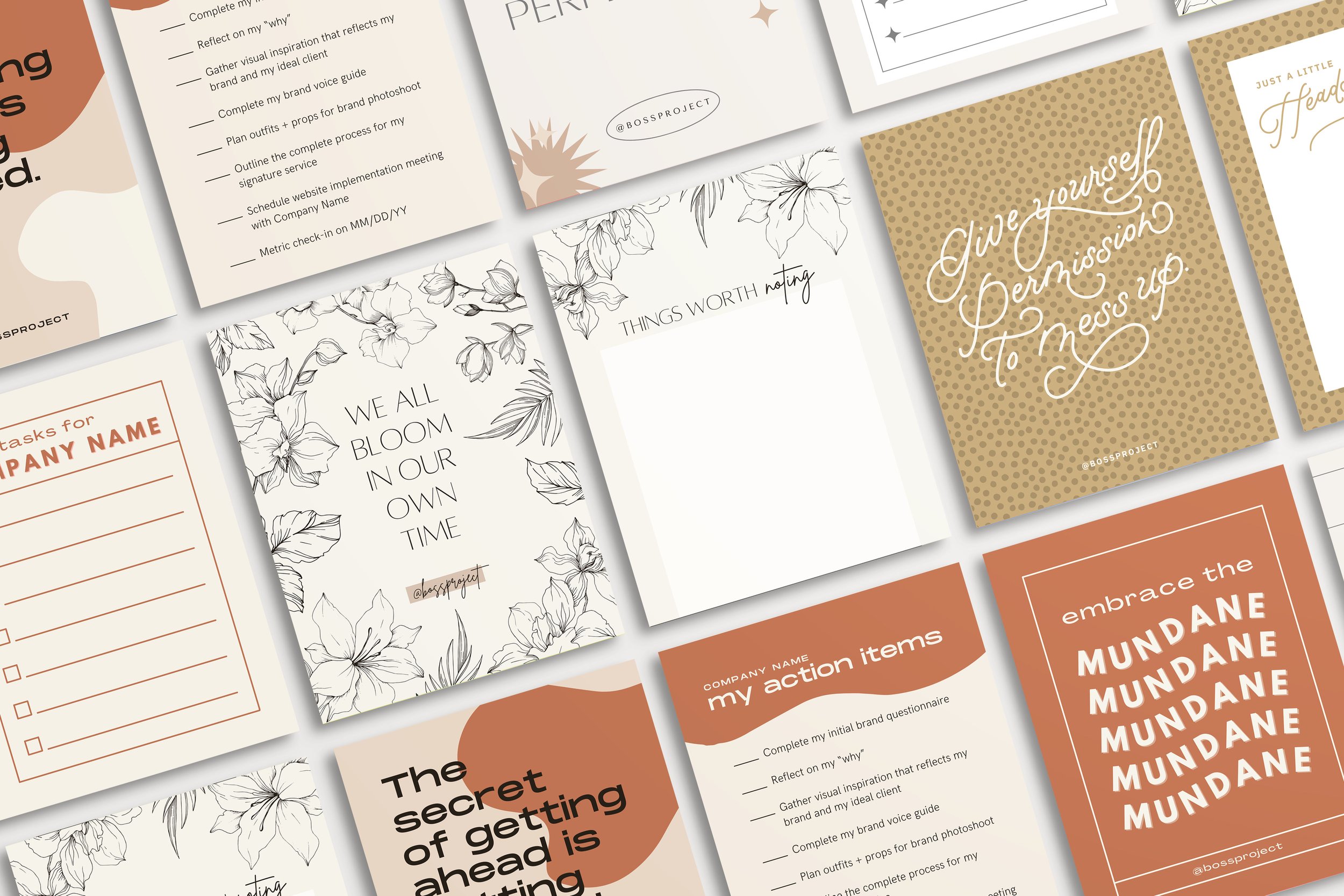
Some Templates for Your Business
Building out all the things can start to feel overwhelming. There are so many little pieces to have in place as you implement your business’ brand colors. Sometimes all you need is a little support to get everything together (cough, cough the Creative Template Shop).
All of our templates come in 3 different color schemes: bright, soft, and neutral. Depending on your new brand colors, you can choose the templates that fit closely with your own. If there is some editing or color swap outs to be done it’s super easy to make our templates match your brand.
Here are a few pieces of marketing to get you started…
An opt-in email sequence is a great way to capture leads and then nurture them into a paying customer. Use your brand colors to help convey your message.

Your social media feed is a place to provide some value to your followers. With value comes excited prospects who want to pay you for more. It’ll be fun to show off your brand colors on social media. Here is where the dots start to connect for people. They see you on social media and then check you out on your website and then sign up for your opt-in, etc. As your brand stays consistent within all those pieces of content it gives off a really professional look. Not to mention, all the work you put in about how you want your customers to feel when they walk away from your brand starts coming together through social media.

Who said snail mail is old school marketing? It’s a sure way to delight your current customers and show them you care. Use your brand colors so it stops them in their tracks!
Girl, your brand is looking amazing!
And there you have it! Choosing the right colors for your brand is a fun step when setting up your business. The Creative Template Shop isn’t just a template shop, it’s a place where all your marketing pieces come together.
Even better? You can join the Co-op membership for only $47/month. You get awesome perks like:
Unlimited downloads of all templates, including all four new releases each month
Monthly releases of our private podcast called The Nugget where we give you the strategy behind each new release
The Co-op private Facebook community where you can come to ask questions, seek support and guidance
Weekly newsletters so you can stay in the loop when new templates release, new Nugget episode drops, sneak peeks at upcoming templates, and more
Are you ready to dive in with us? Just head here to join The Co-op and let us become your new marketing department!


